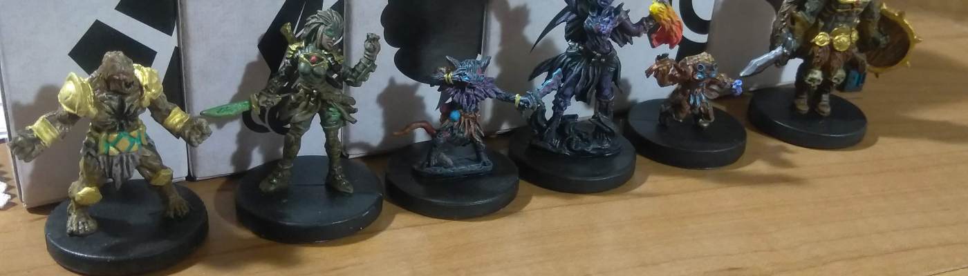
Let’s talk about Gloomhaven, a game so big and complex that I’ve hardly played it at all despite my substantial investment in it. Storing it is nearly impossible without a $80+ custom insert, setup takes 30 minutes even with that, a given playthrough can last months of consistent play, and you might not even see roughly half the content because of the way it unlocks.
But it’s genuinely an adventure like no other, with real, meaningful decision making, a sense of progression as characters unlock, grow, and eventually retire and the map slowly fills itself in, and a staggering amount of content – all wrapped in an astonishingly slick euro-style engine. The setting oozes with theme and personality, the character classes have genuinely different playstyles to let players experience many different approaches to the game even if you build them in a “standard” way, and on top of all of that it’s relatively deterministic so that you don’t have to rely on guesswork and random chance like the American-style equivalents like Descent. It’s definitely not for everyone, but I’ve been genuinely stunned at Gloomhaven’s quality and merit.
So obviously I painted it (or at least the starting six classes)!
Miniatures Toolkit
For this project, I used the tools described in the Miniature Painting Toolkit Deep-Dive. Take a look there for more information!
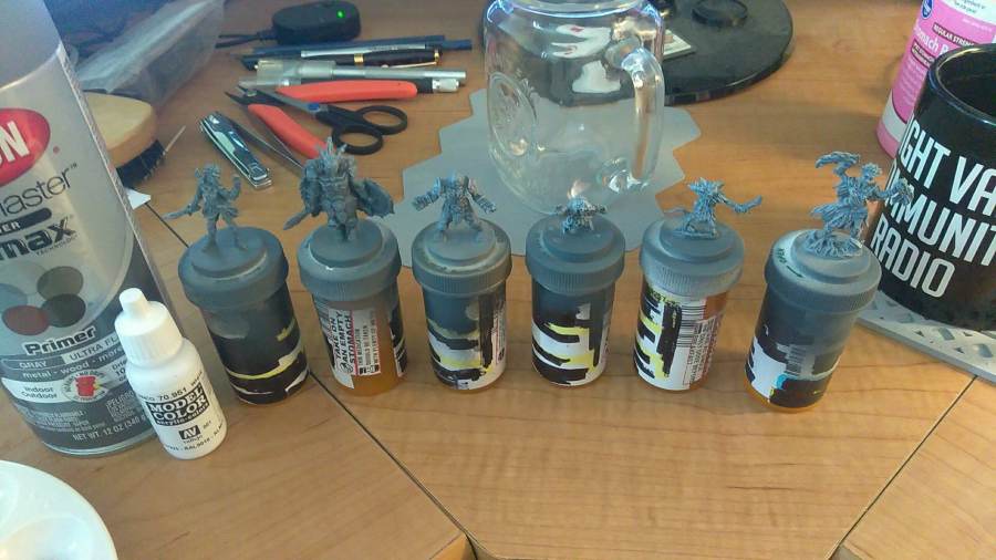
I started with a variant on the blackwashing technique, which would typically consist of priming black and drybrushing the entire piece in white. In this case I used gray primer instead, to deliberately desaturate the final color scheme and make everything look as grimy and gross as possible, which the setting seemed to demand. Each color scheme was selected to match the game art as closely as possible, which was admittedly sometimes skewed slightly by the backlighting in the pictures.
Then it was time to get started. At the time I was in the midst of my regular Selfish Stream, so if you’d like to see my process up close and personal, you can find a playlist of the livestreams in which I painted these pieces here. Please pardon the nonspecificity of a lot of my paint selections here as I’ve forgotten most of what I used, though the livestream VODs contain all of it in much greater depth.
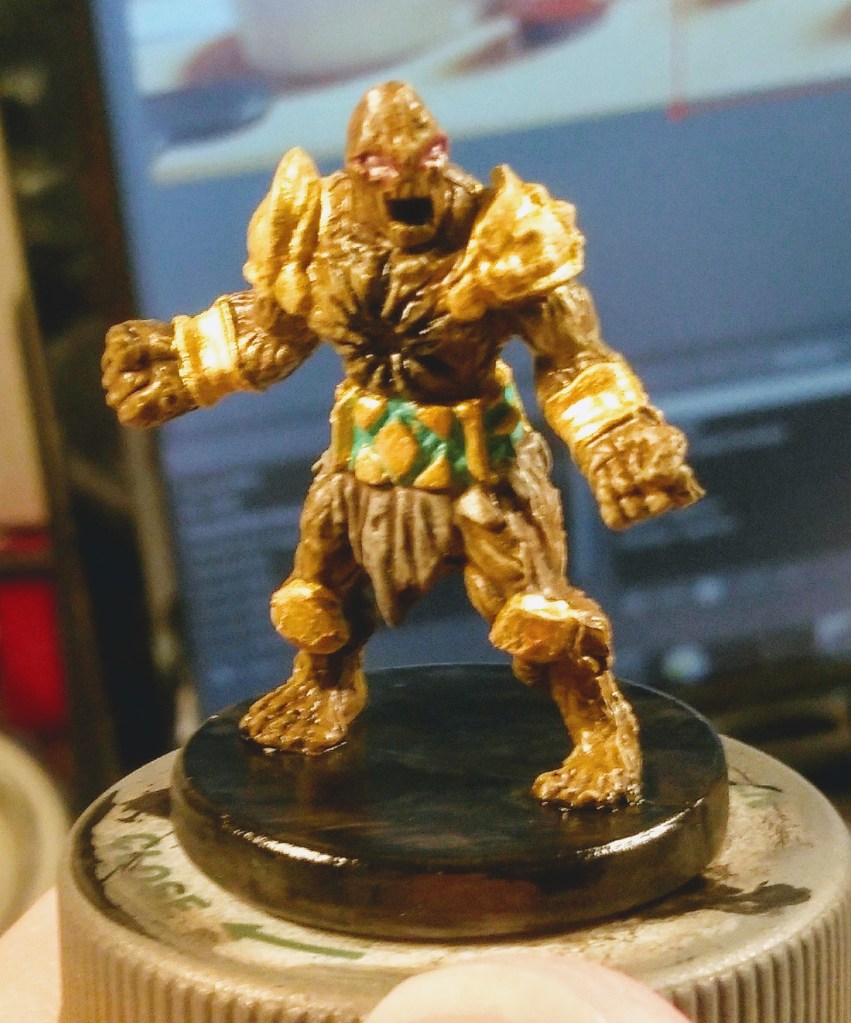
First off was Boot the Cragheart, for whom I applied a wash over his brown basecoat followed by a uniform drybrush of another brown shade. His chest cavity and mouth each got straight black paint, and the belt and gold armor all received a coat of white paint followed by all of the requisite shiny bits. I also added some Turquoise to the inset parts of his belt and he was done.
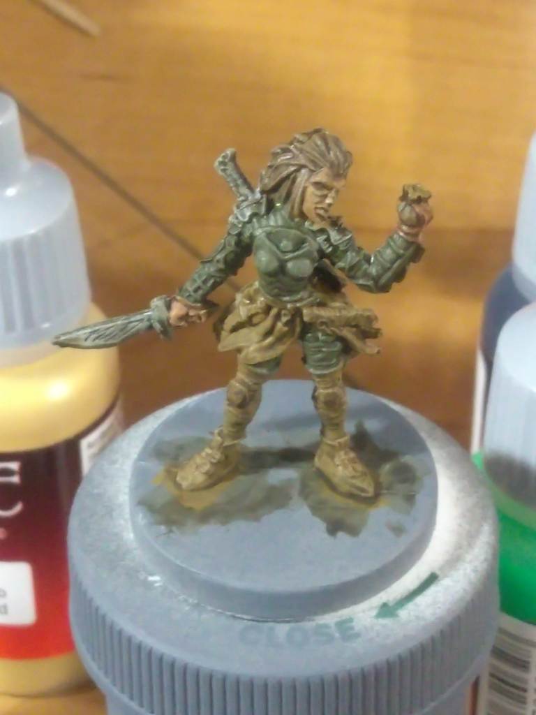
Next I went for the Scoundrel, given in our party the bonkers name “KerrigAn Biz-Monet” for reasons I cannot fathom. Here we see her with just about all of her basecoat sorted out but none of the details.
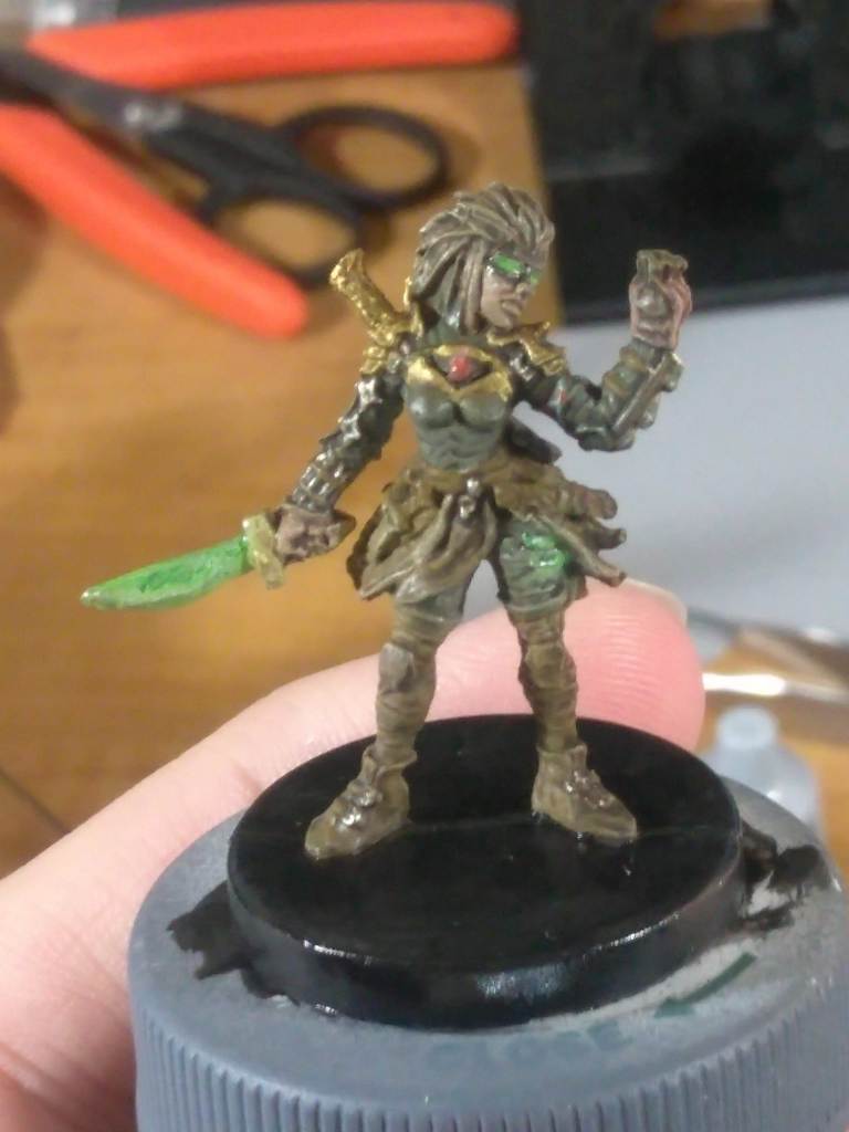
Something I’ve been repeatedly startled by is how many little details there are on the sculpts that you don’t even see until you start painting and matching them to the art. For example, she’s got far too many knives strapped onto her belt, plus tiny darts and shuriken and poison blades all over.
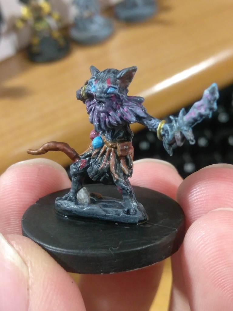
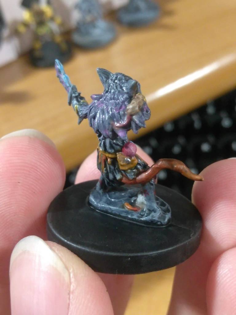
This little Mindthief weirdo is named Ohio Onion and is another stellar example of details you simply gloss over – even in the art – when the mini is flat gray. Turns out he has two little rat buddies and glowing runes scattered around his body! I also took the opportunity to sneak a pair of Diablo vials on his belt, just for fun.
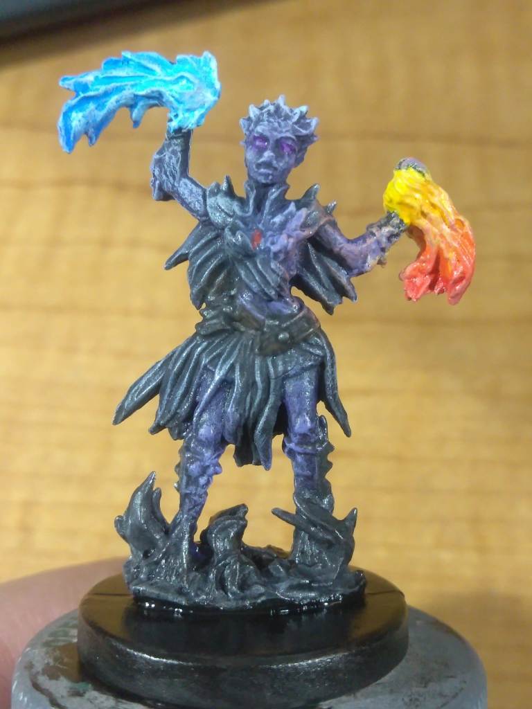
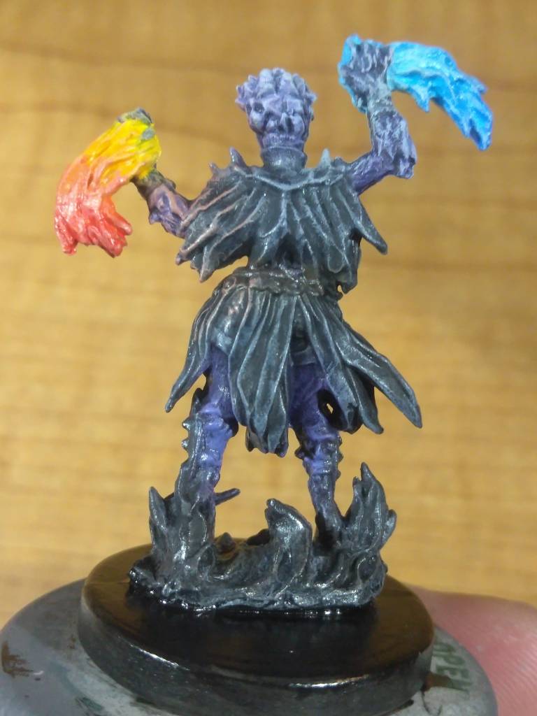
This is my first character, Ianis the Spellweaver. I’ve seen a lot of overdone OSL (Object-Sourced Lighting) on this mini, and a lot of crazy-colored clothes – and most commonly the smoke around her feet is rendered as fire simply because its shape resembles the two magic bolts she holds. I tried to keep mine fairly by-the-book as with everything else in this project, which involved putting a lot of attention on making sure the textures popped through drybrushing in several layers. I confess I did take a crack at my own OSL here, though I tried to keep it as restrained as possible.
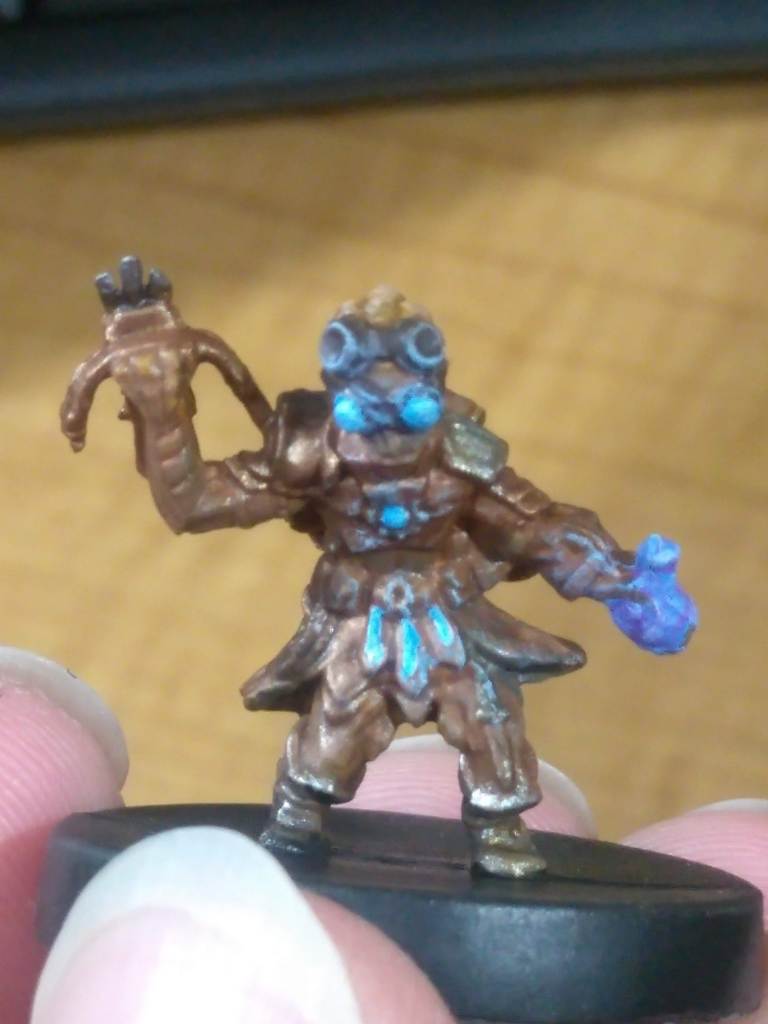
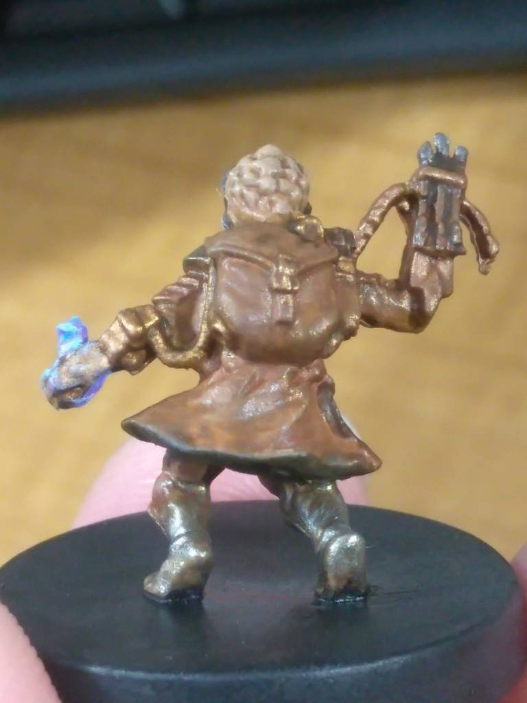
Meet what is easily the weirdest-named character I can think of, in any medium and any story: the Tinkerer named Sunshine Dope Chillin’ “Drag Strip” Twirlshy. My spouse used a random name generator to come up with ideas, selected every category and just picked one of the full names instead of the original plan of just picking one or two words, and that insane mish-mash is what fell out. Anyway, his paint scheme was a lot of bronze-on-brown, which I fully expected to come out a bit bland, but thanks to all of the finer details like the lighted belt, chestpiece, and skirt armor he actually manages to read pretty well from a distance. That potion bottle was a lot harder than I feel like it should have been, though.
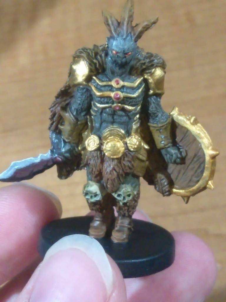
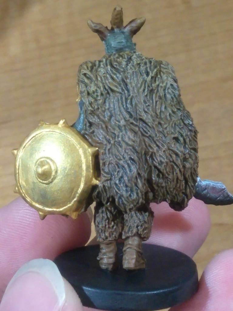
Finally we have Gordeaux the Brute, my second character. The specific colors I chose and the techniques I used to apply them immediately outs me as having researched Sorastro’s techniques for this particular piece, though my skill level obviously falls fairly short and my finished piece is less elaborate. Another major difference is that his is dramatically more colorful even when accounting for the differences between our respective photography setups and skill levels, and that is because of the gray primer I mentioned earlier sucking the color clean out of these minis. That was intentional, believe it or not, because while I really love how a lot of other painters glowed-up these characters I didn’t find very many that really looked and felt like the dark, dim, pessimistic schemes of the game’s actual art.
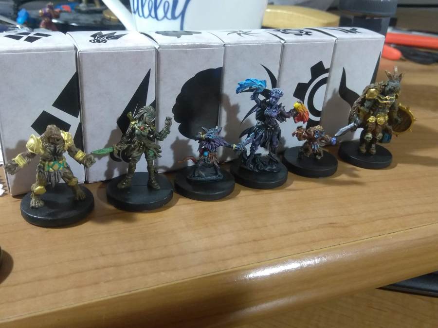
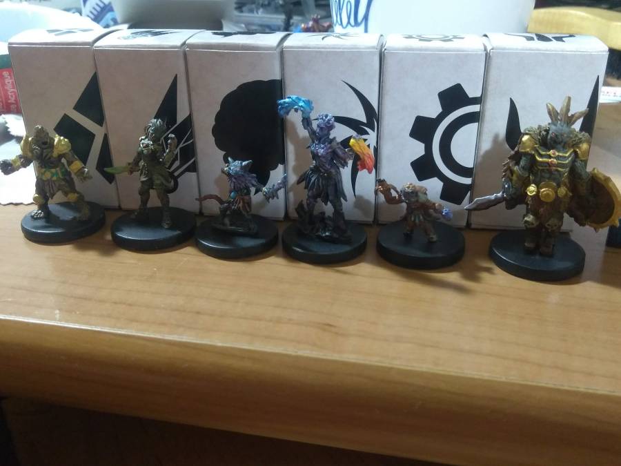
The result of those decisions is that there’s very little bright color on these pieces, even the relatively flashy ones like the Tinkerer or Cragheart (with notable and spectacularly obvious exception to the Spellweaver’s hands). The only real splashes of color that really pop out at a glance are the metallic or magically-glowing parts, with everything else leaning towards gross desaturated grays and browns. In a setting like Battlestations, or Mice & Mystics, that decision would be a project-killer, but in the grimy, depressing world of Gloomhaven they feel right at home.
The clue was right in the name, I suppose.
 cogthecat's crafts
[…] with my first Gloomhaven post, I started with Krylon gray primer and applied a drybrush of white to simultaneously give the piece […]
LikeLike