Mice & Mystics is published by Plaid Hat Games, designed by Jerry Hawthorne, and sculpted by Chad Hoverter. It’s the first in their growing line of Adventure Book games, in which there is an ongoing narrative between sessions. They’re generally family-oriented and the concepts for them are consistently very cute and fun – see also Stuffed Fables, a game about stuffed animals protecting their child from her nightmares, and Aftermath, another mice game about tiny heroes cleaning up after the apocalypse that destroyed human civilization. In this case our story follows Prince Collin and his friends as they try to save the kingdom and Collin’s father, King Andon, from the evil Queen Vanestra – but almost immediately they get cornered and have to rely on the court magician Maginos to transform them into mice!
Mice & Mystics in particular has a few issues with its rules since it was really their first try at this kind of game, but as the owner of my local game store put it, Mice & Mystics is the only game worth playing in spite of its rules. In my experience so far it’s not quite that dramatic, but there are definitely quirks to get used to before you can fully dive into the wonderful narrative and rich setting. That said, on the whole this is a genuinely lovely game full of personality and endearing characters.
Plaid Hat was founded by and staffs in part Heroscapers.com community leaders, so it’s no surprise that Mice & Mystics features a lot of ideas drawn from Heroscape like combat dice with a bunch of different uses and squad movement (and if calling them “Rat Warriors” instead of just “Rats” isn’t the most Heroscape thing ever I don’t know what is). Given that Heroscape is my all-time favorite board game it’s no surprise I enjoy this one, so take my advice as you will.
As always, see my toolkit deep-dive for detailed information on the paints and other tools I use for this and other projects.
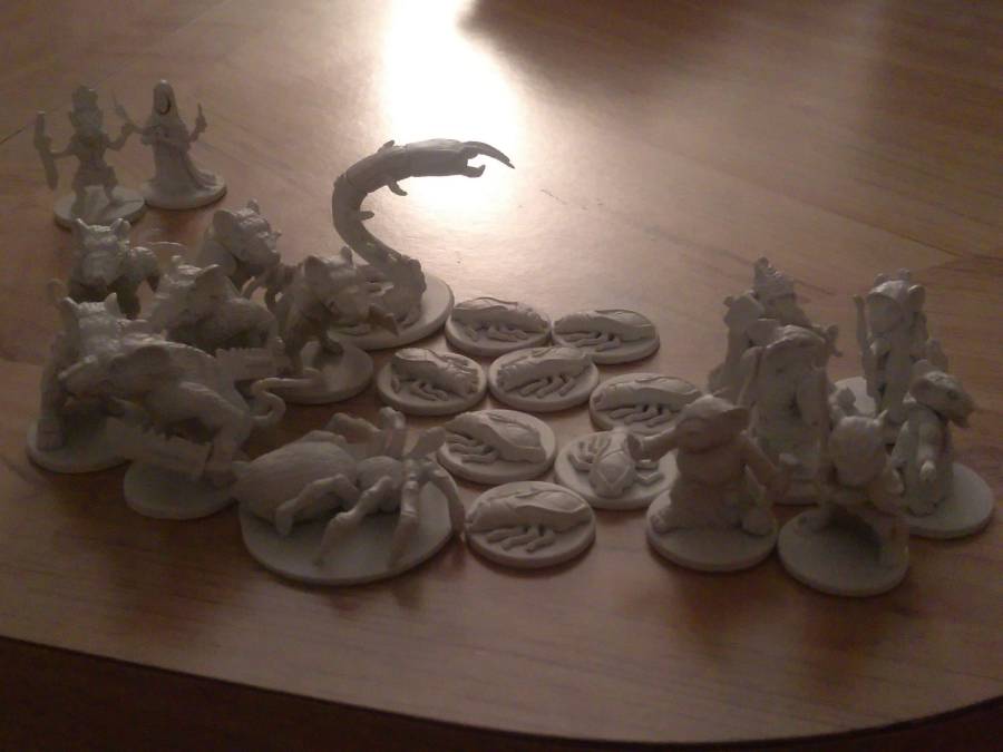
First things first, I applied primer to all the figures to get them ready to go. I used my then-usual white Krylon primer and then started in by…
Painting the Minions
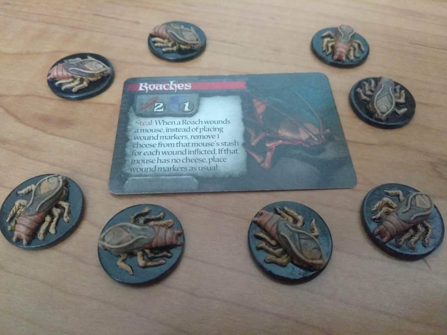
Shortly after starting this project I got hold of Vallejo’s Game Ink set and used it extensively throughout. The first pieces I painted were the Roaches, which went together quite easily in a single session despite there being eight of them. This was before the inks turned up, so I used conventional paints that in retrospect I think were slightly too contrasted with each other to get this result:
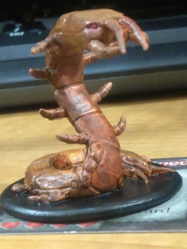
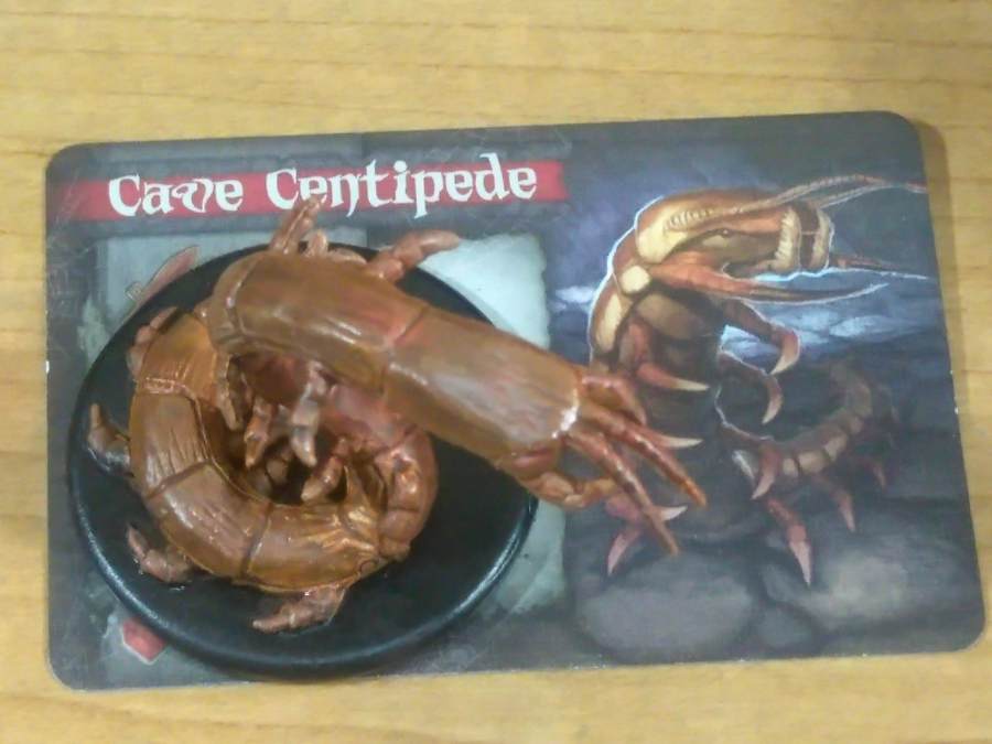
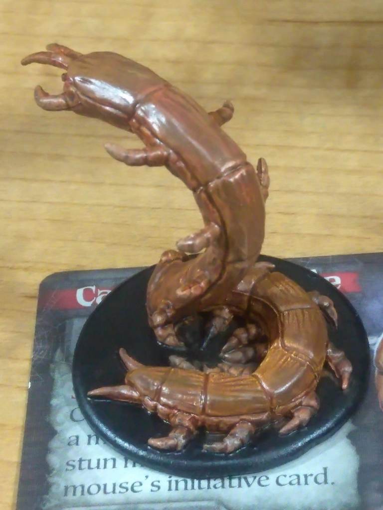
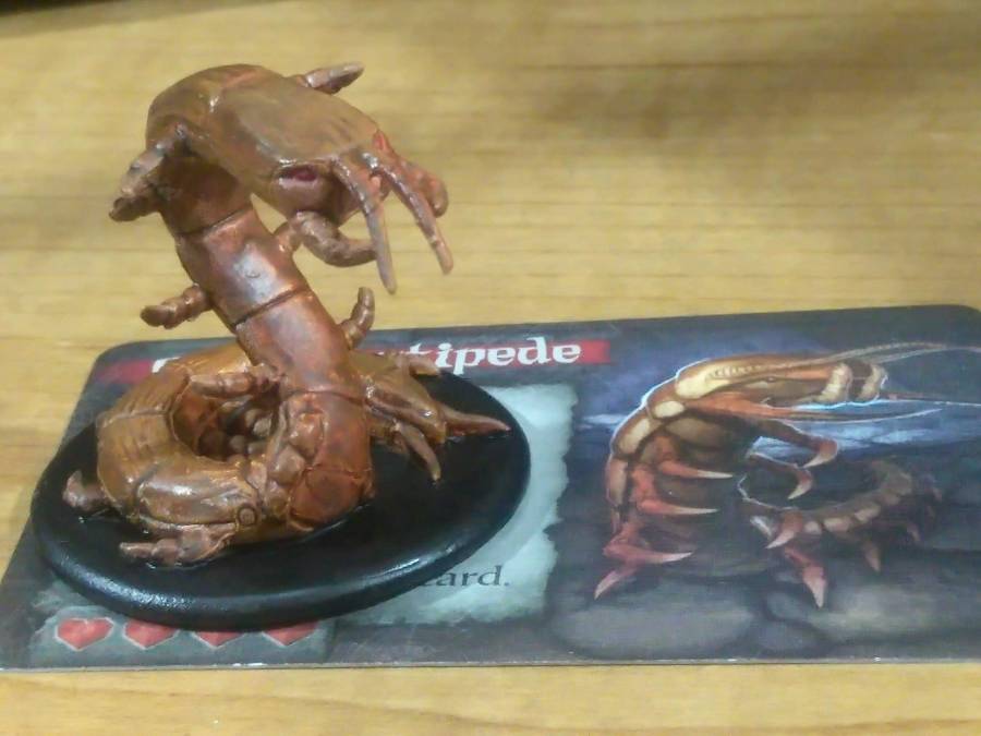
After that I got my inks and the whole game changed, so to speak. I put the Centipede together using inks for the basecoat and a bit of detail like the duller carapace with normal paint, followed quickly by the Spider using nothing but a couple of inks. Weirdly, the Spider’s sculpt deeply creeped me out when it was just plain beige plastic, but the act of painting it made it basically fine even though it ended more realistic than it started.
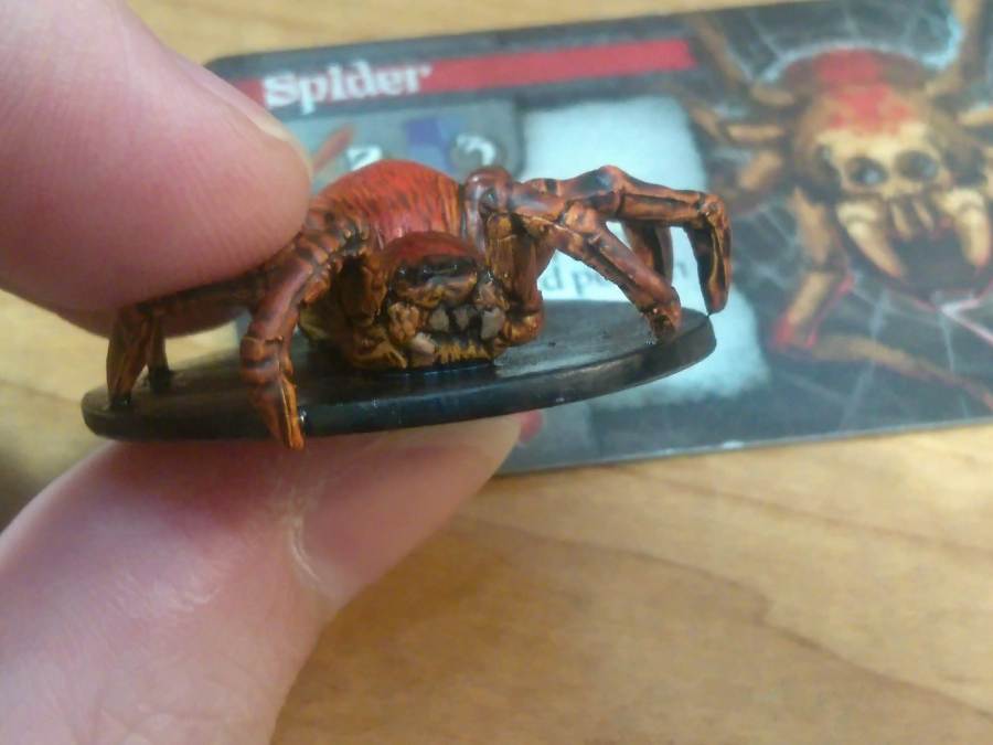
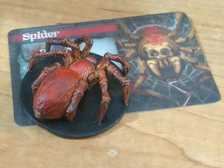
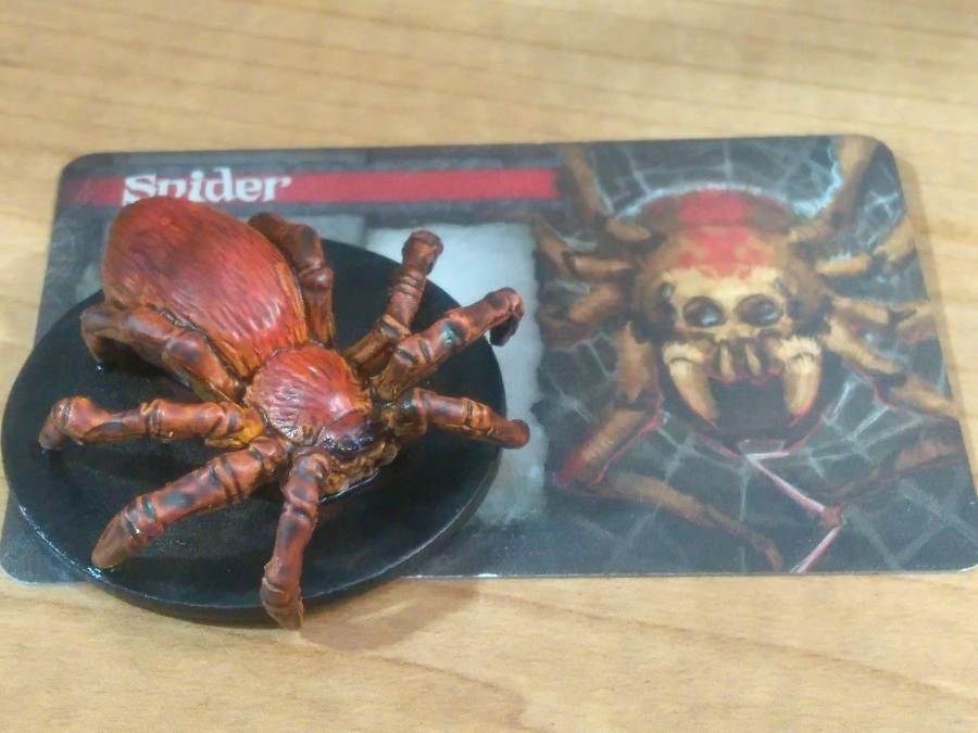
The Spider’s paint scheme deserves a little additional discussion since I got some neat effects there. Most of the colors are achieved with the Brown and Skin Wash inks combined with other thinned-down inks layered over top. The legs and underbelly had thinned Black added on, and the back of the thorax and abdomen got some Red – in both cases mixed in with my glazing/thinning medium as usual and layered on in a couple of coats. That gives a lovely gradient from the normal body color to a deeper warm red that, while it doesn’t mirror the speckled pattern in the card art, still gives an impression of a comparable species.
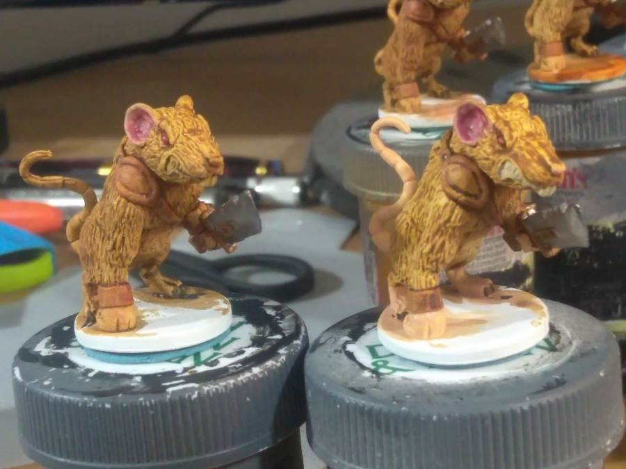
Then it was time for the Rat Warriors, ever obnoxious in game. I’m not entirely happy with how their fur and skin colors turned out since they’re both a touch samey and desaturated from where I wanted them, but the overall paint job is quite satisfactory.
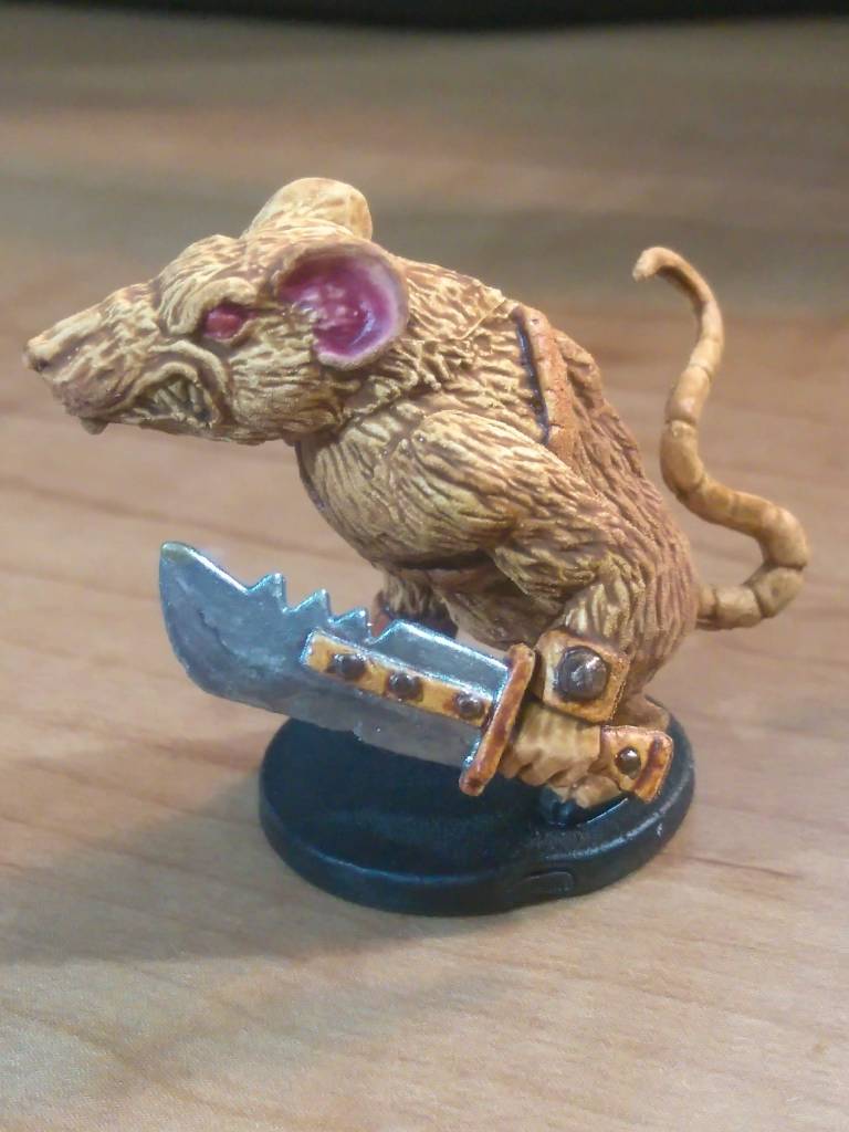
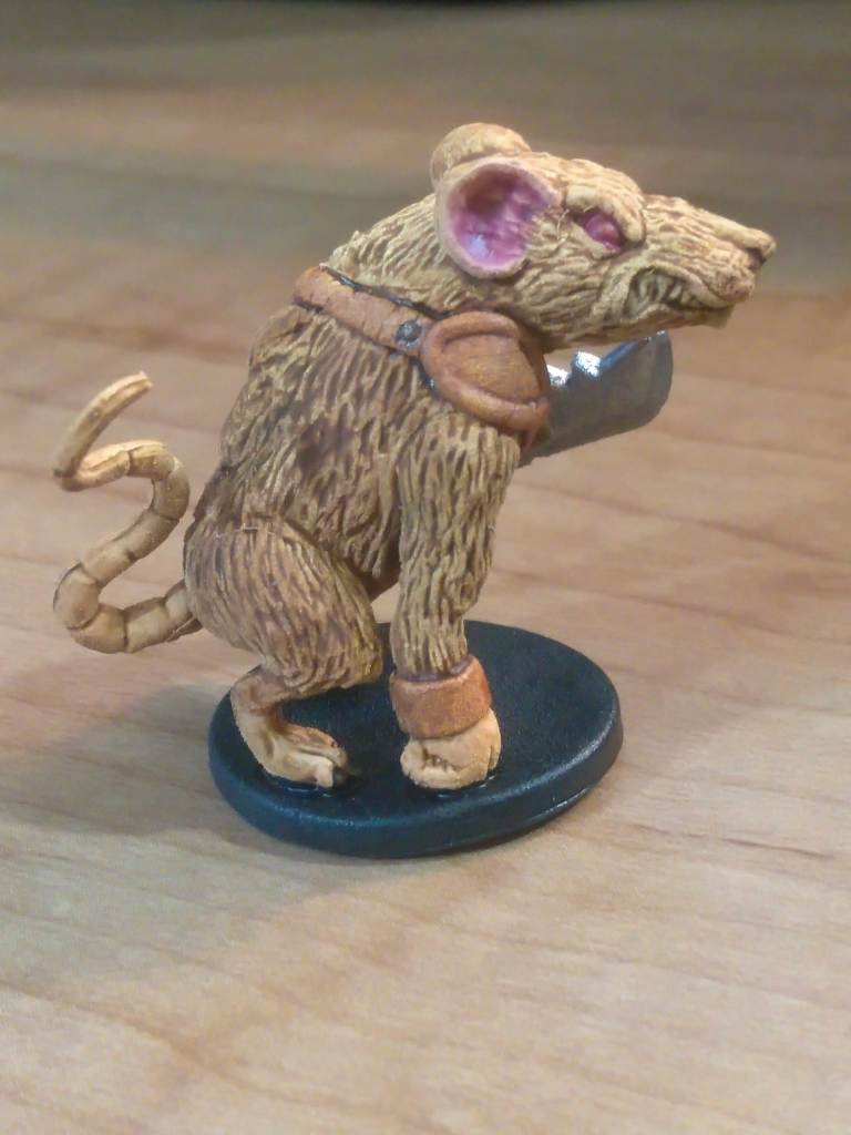
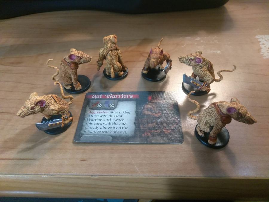
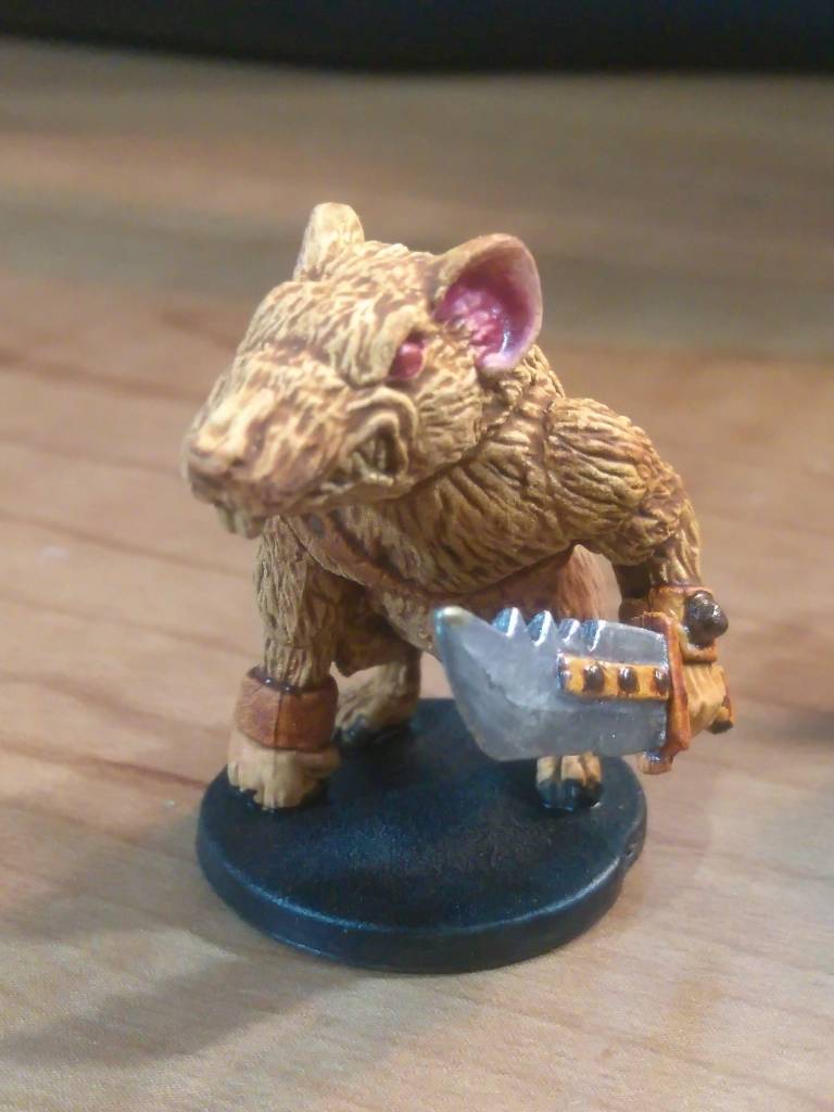
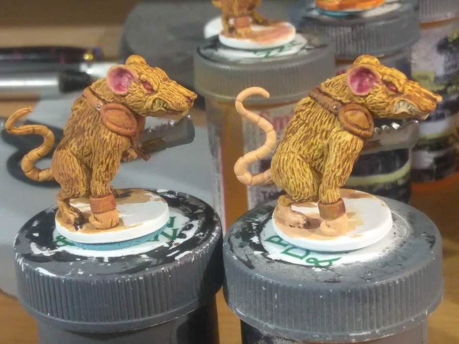
This paint job was a bit more involved than the inks-only critters since their fur needed a mix of ink and paint on the details, plus they had to be washed over top of their skin color, but it still wasn’t anything too crazy. For comparison, I took photos between adding the wash over the details so that you can see how much of a difference such a simple step can make, even on a piece that’s already close to complete.
Painting the Mice
After the batch paint jobs on the minions were done it came time to start in on the fun parts: the heroes! The character designs in this game have a lot of personality and color to them while still remaining decently grounded in reality, which gives them vibrant and fun details over pleasant earthy tones. I got to play around with a lot of new techniques working on these guys and really enjoyed getting them put together.
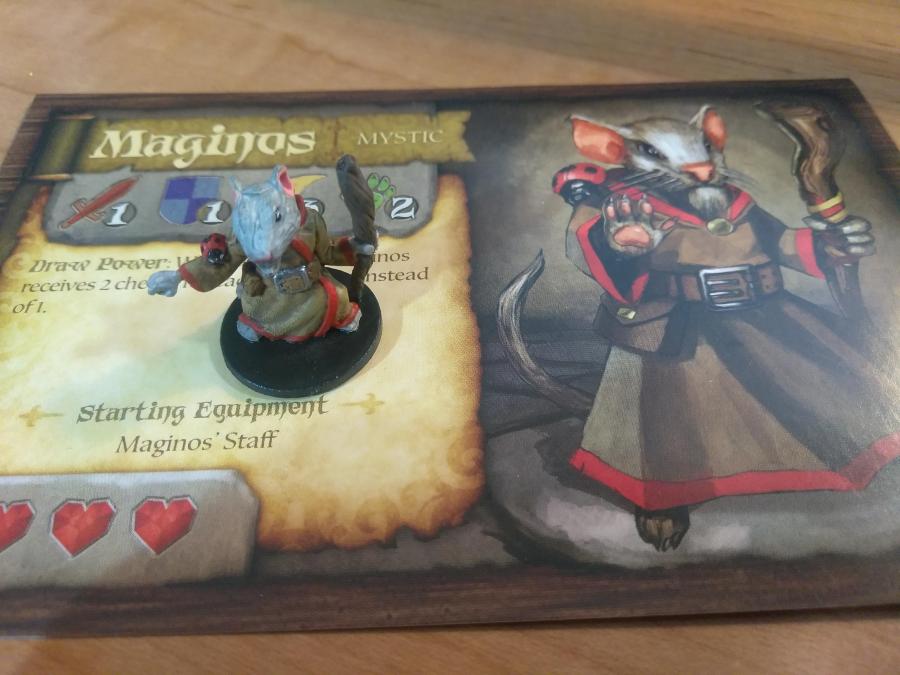
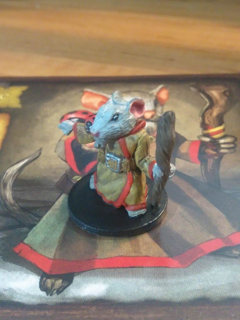
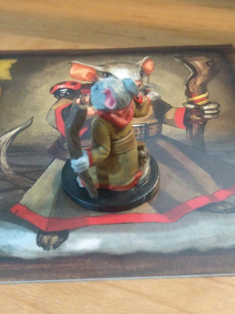
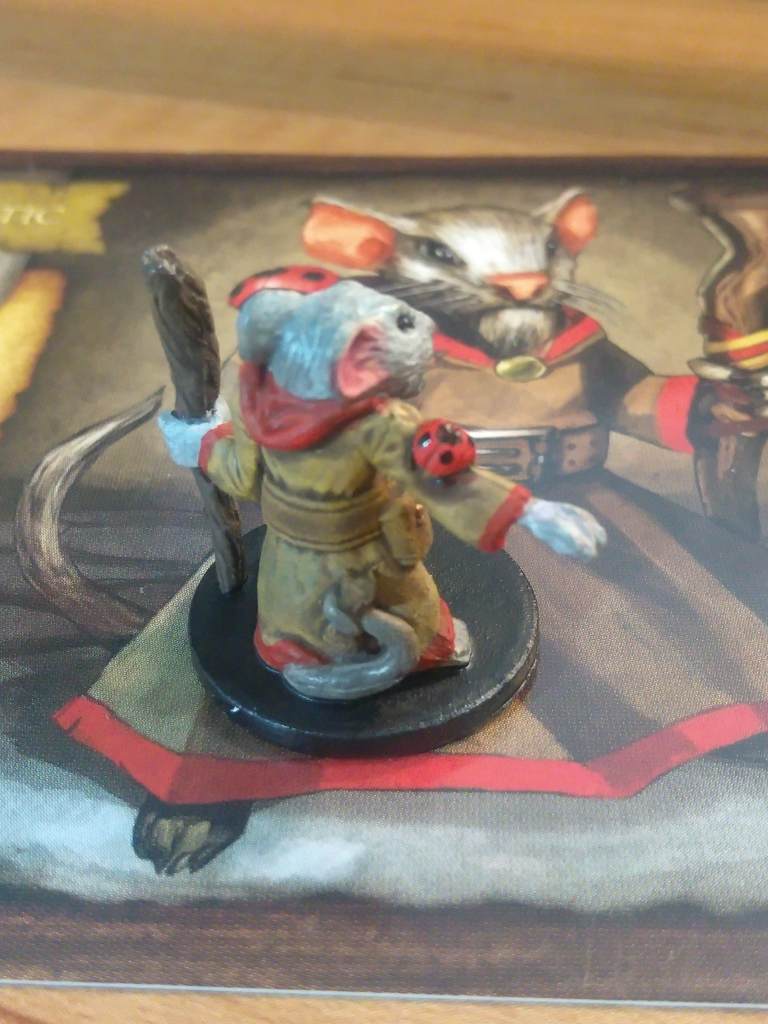
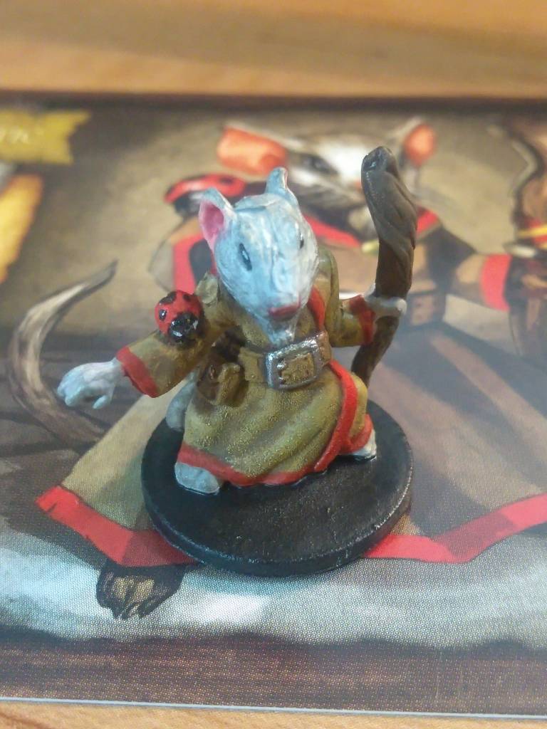
I started off with Maginos and had frankly a ball getting him together. Most of him was somewhere between a pretty standard basecoat-wash-drybrush and the cheating-with-ink mentioned above, but all of those rich reds were red ink on top of the underlying color with no repainting or other undercoating. The art and his actual mini don’t quite match up so I had to improvise a little on the robe, but it turned out fine and, if I do say so myself, rather elegant.
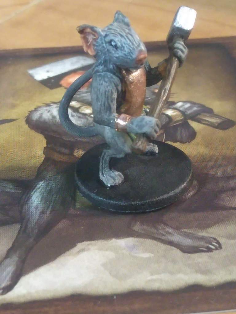
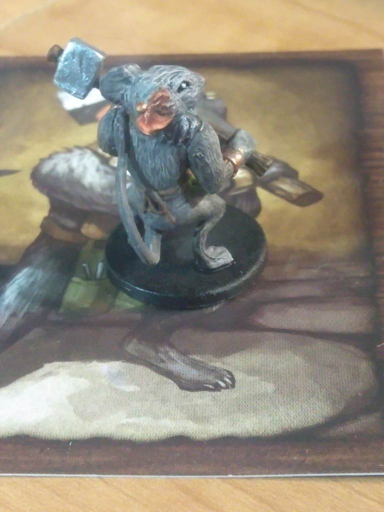
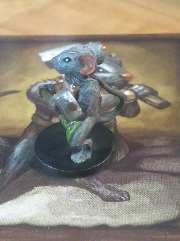
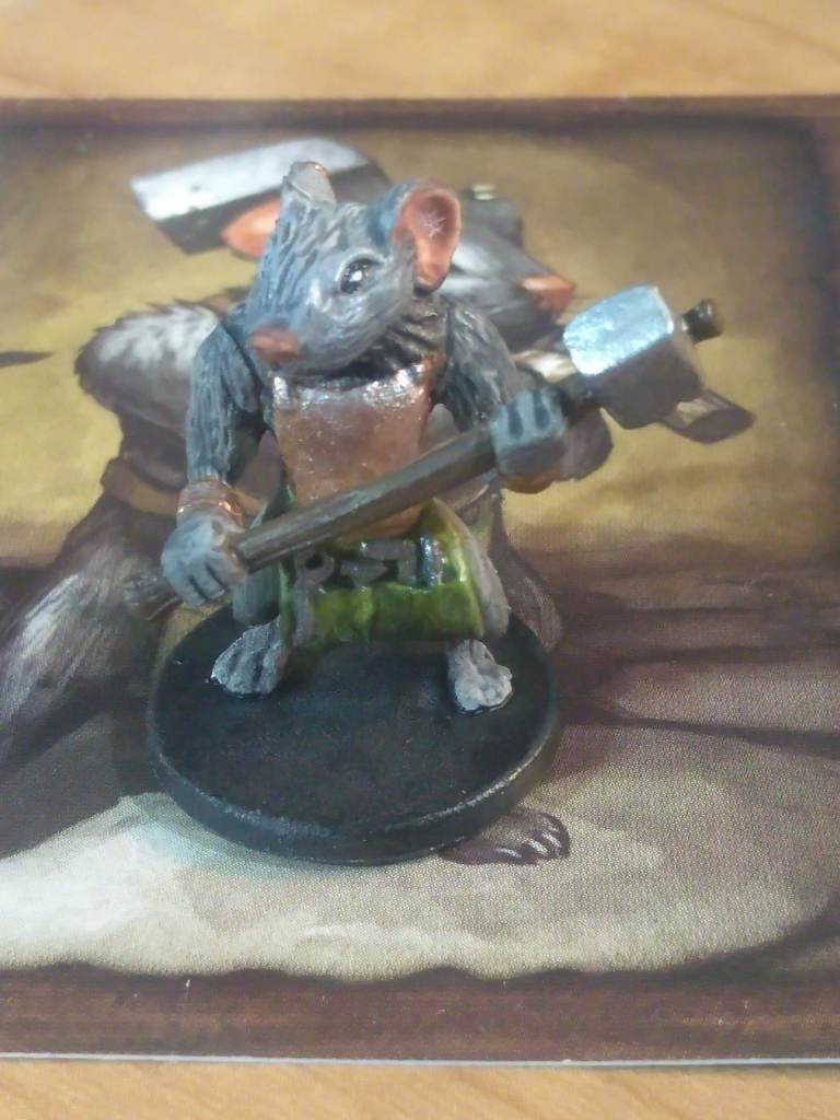
Nez was a particularly interesting figure to paint because until I actually started picking out colors for him I couldn’t tell that he was wearing a metal breastplate or that that he had tools on his apron. I saw the hammer and kind of stopped there. But it was fun doing those big chunky metal parts next to all of the textured wood and fabric and fur.
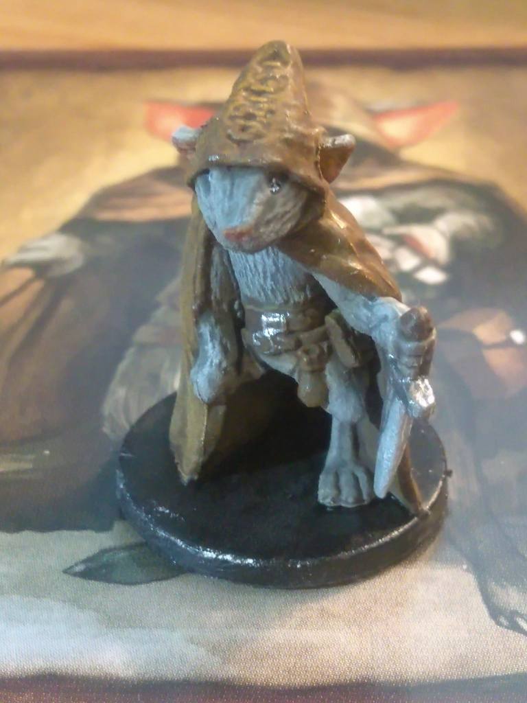
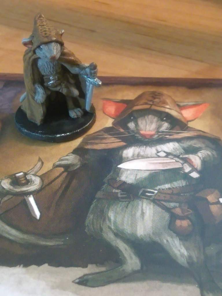
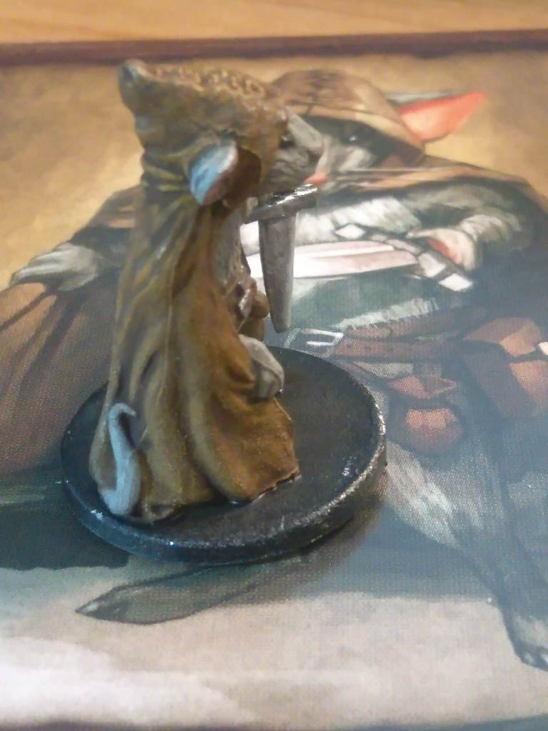
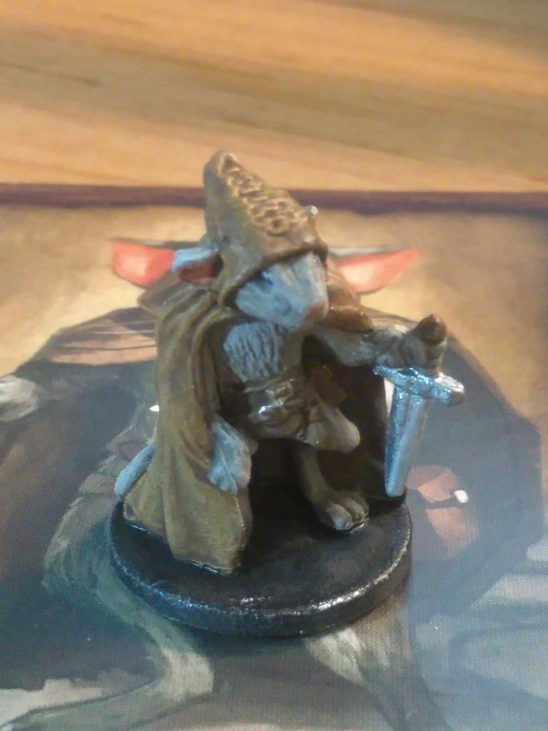
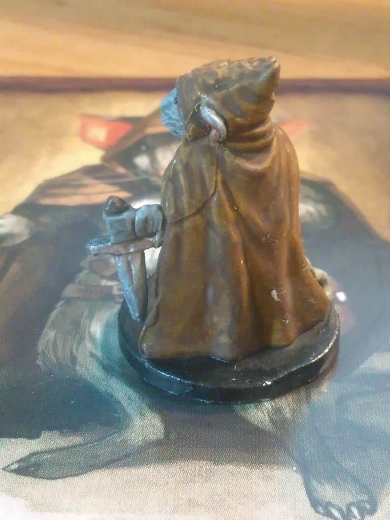
When I started on Filch I kind of assumed that he’d end up being really samey to paint on account of all the browns and grays, but he was actually pretty fun. The cloak in particular was really neat since it allowed me to play a lot with different color values within the same main color. There’s a couple of spots on his back in these photos where the paint scraped away before sealing, but I corrected those on the final piece.
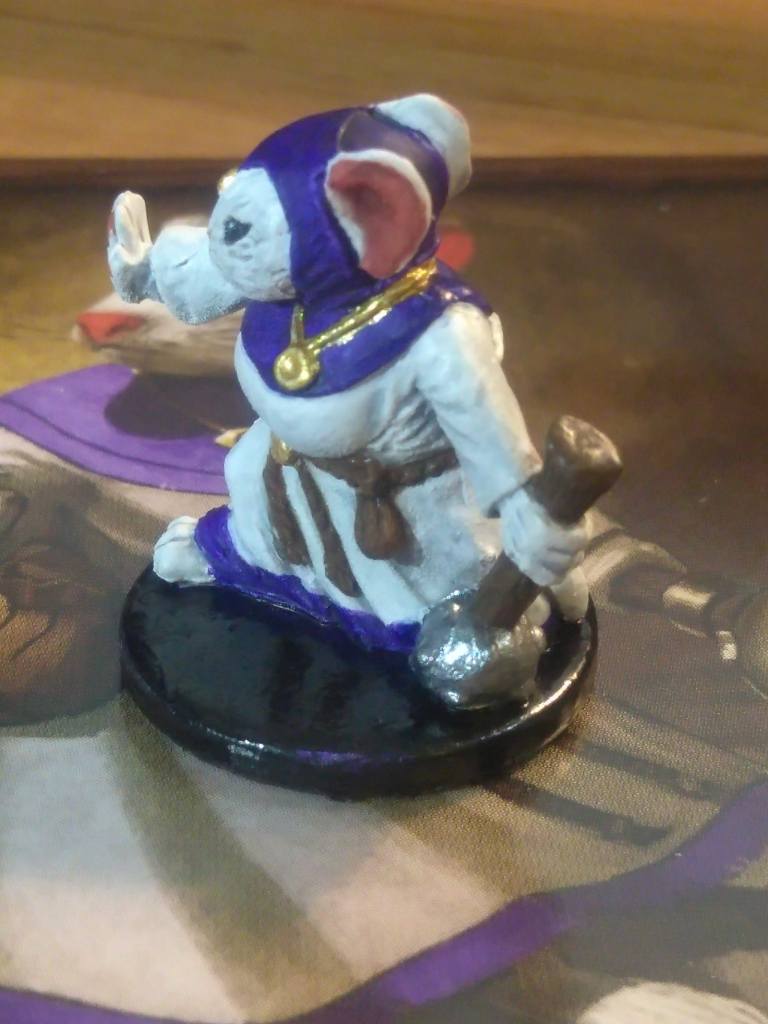
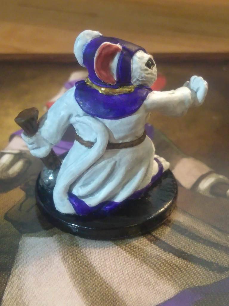
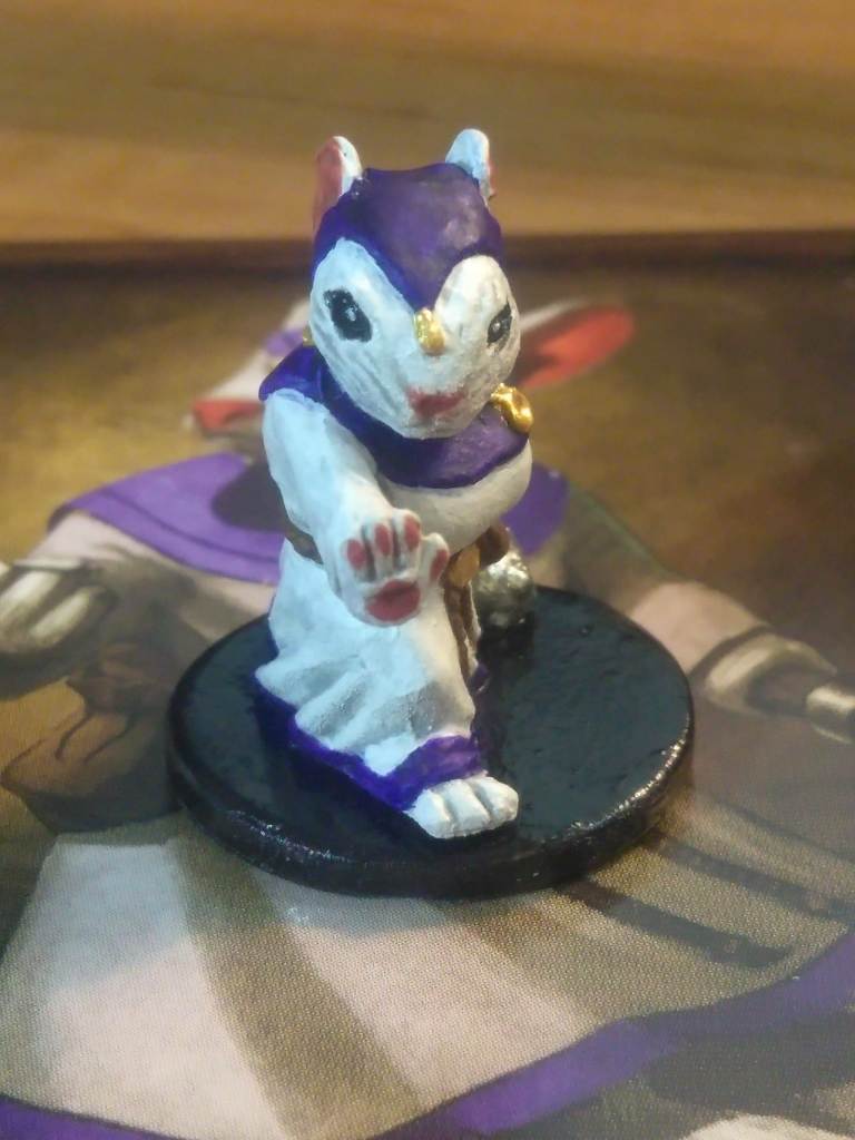
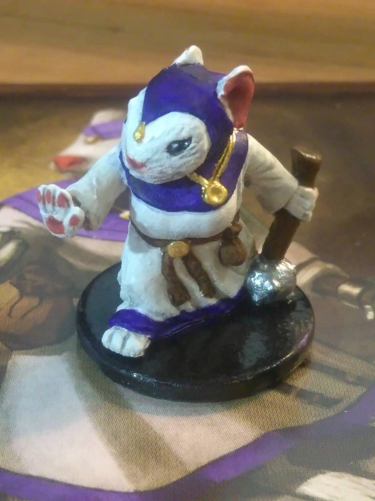
Tilda’s robes came out a tad darker and more heavily saturated than I’d intended because instead of mixing blue and purple inks to get that color I decided to apply blue and then put purple over top of it in a second coat. I wouldn’t say that was a mistake since I quite like the result, but it definitely had an unexpected effect. She also required a lot of white-to-gray shading on both her fur and robes, and oddly enough she’s one of only two rodent characters whose palms and fingers you can see, so she’s also almost the only one who gets pawpads, which in turn I had to freehand since the model is too small to retain that detail.
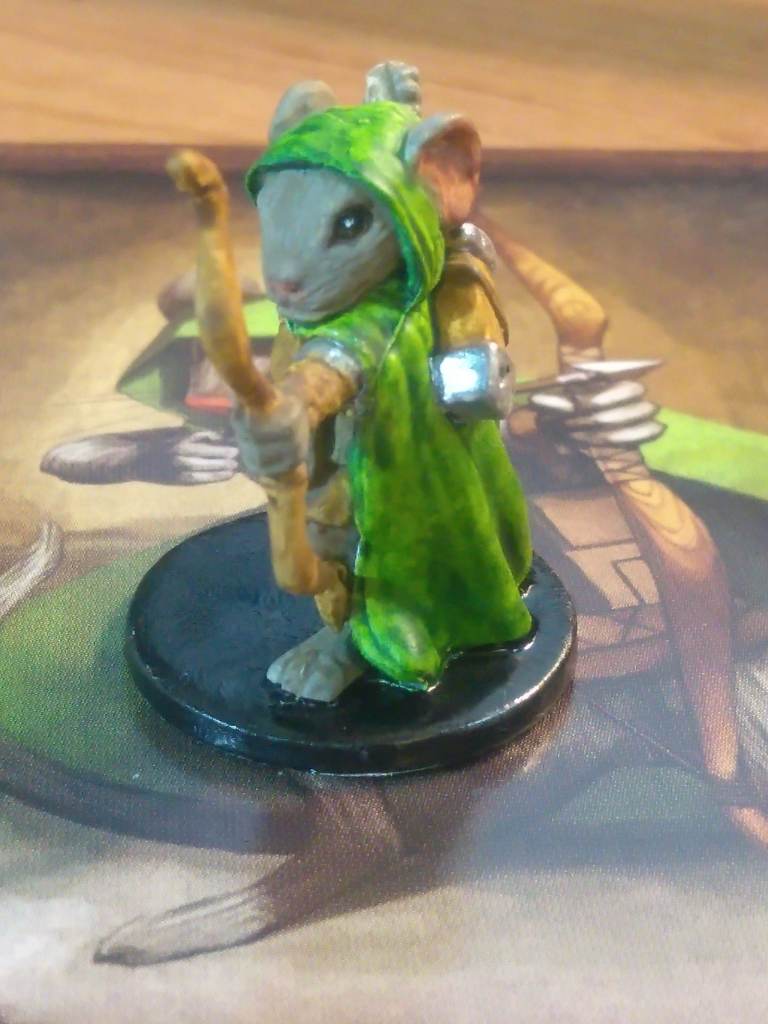
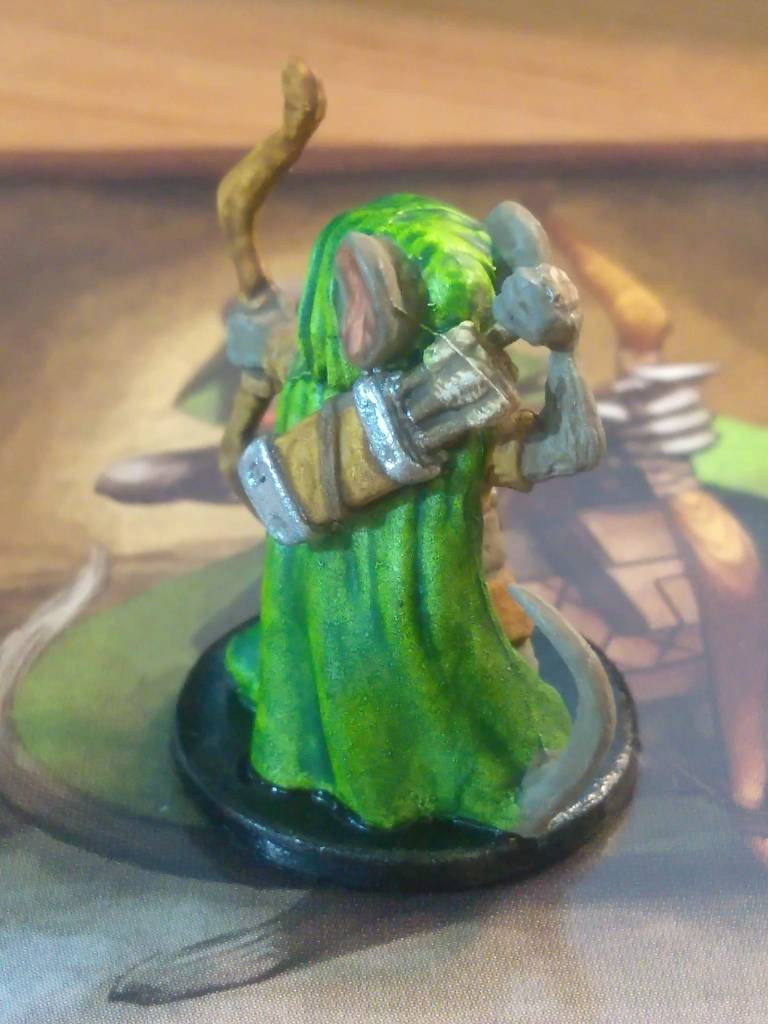
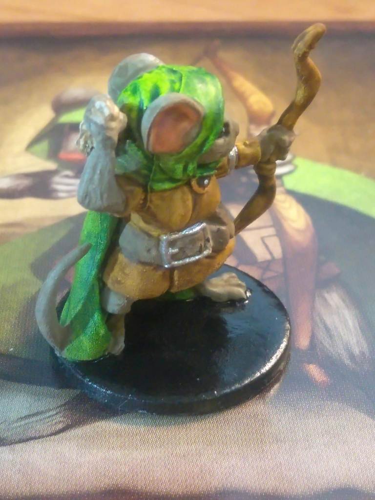
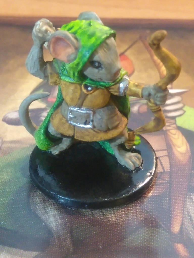
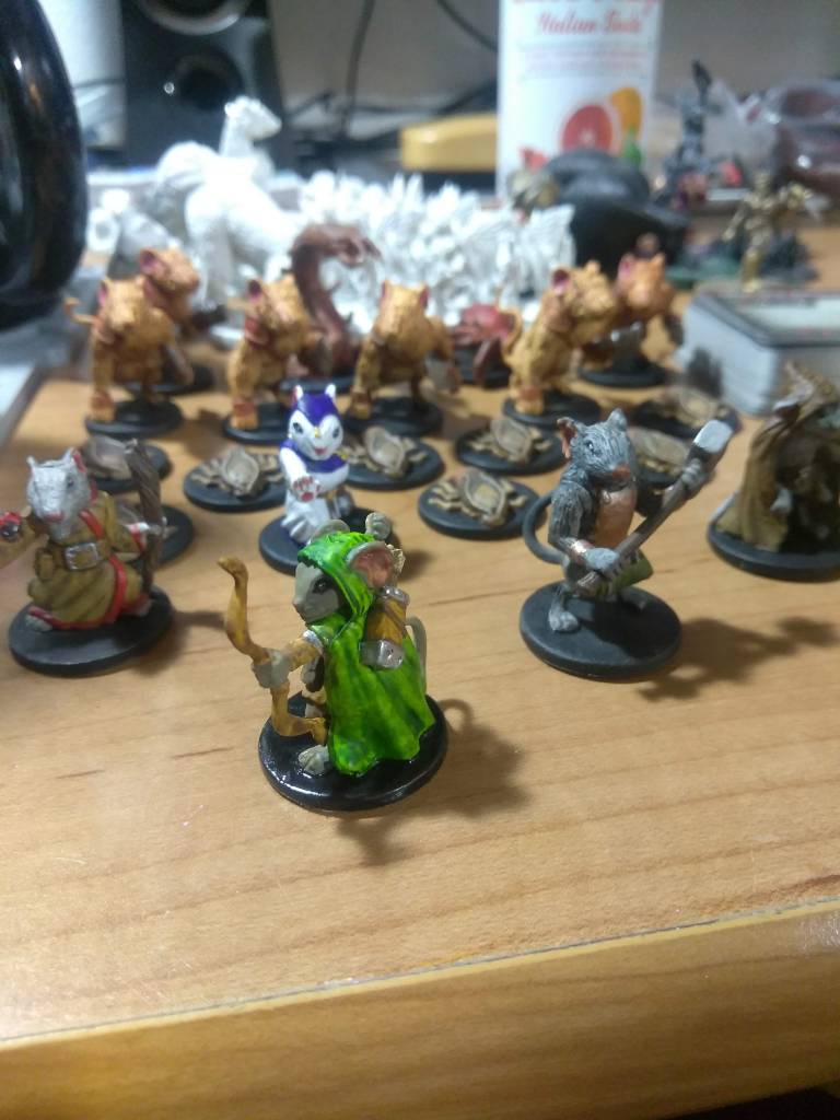
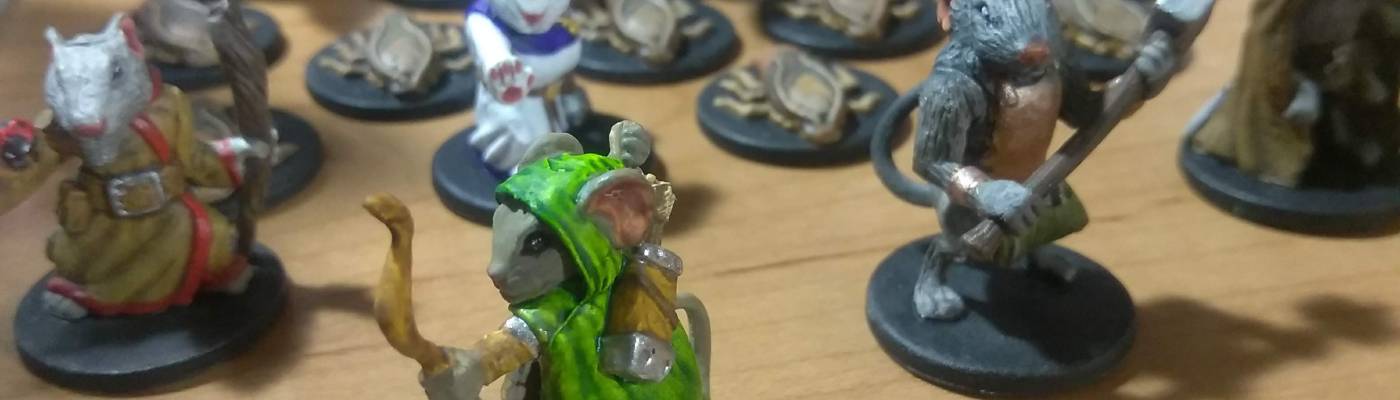
When I started off this project, I was really excited specifically for Lily because of the vibrant color of her cloak, and she actually really lived up to it. The cloak was a mix of the yellow and green inks to keep it bright and limey, and her tunic balances it out nicely with a light tan that most of the other clothing didn’t get. Between that and the details on her quiver and neck clasp she turned out really nice.
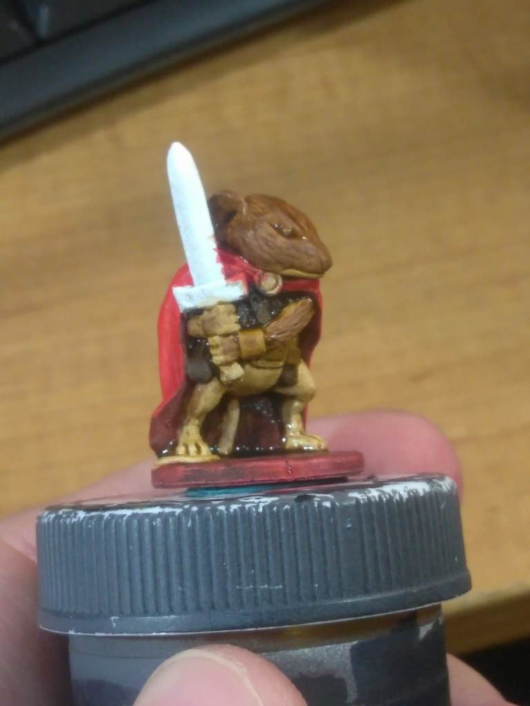
With Collin I actually thought to take a progress photo, so you can see here what he looked like after a couple of coats of red on his cloak and partial layering on the rest of his body.
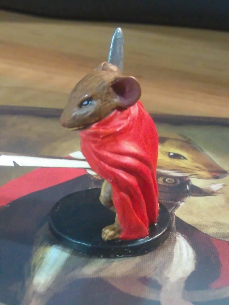
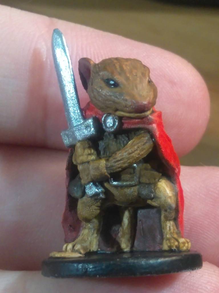
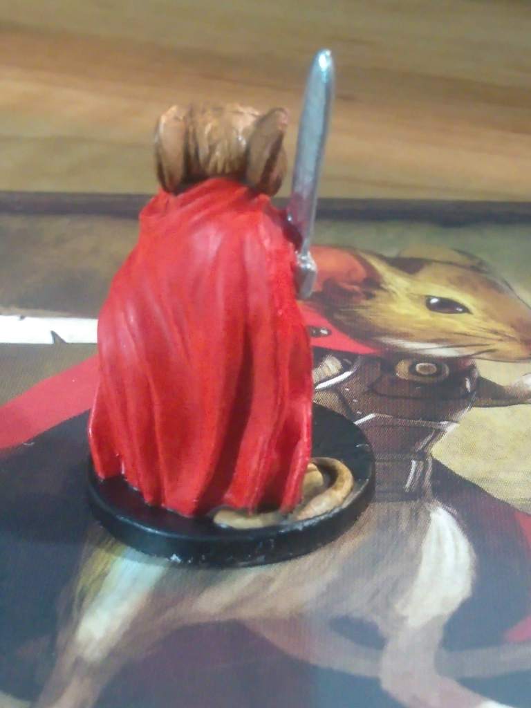
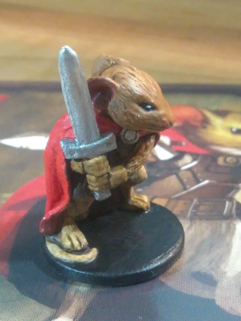
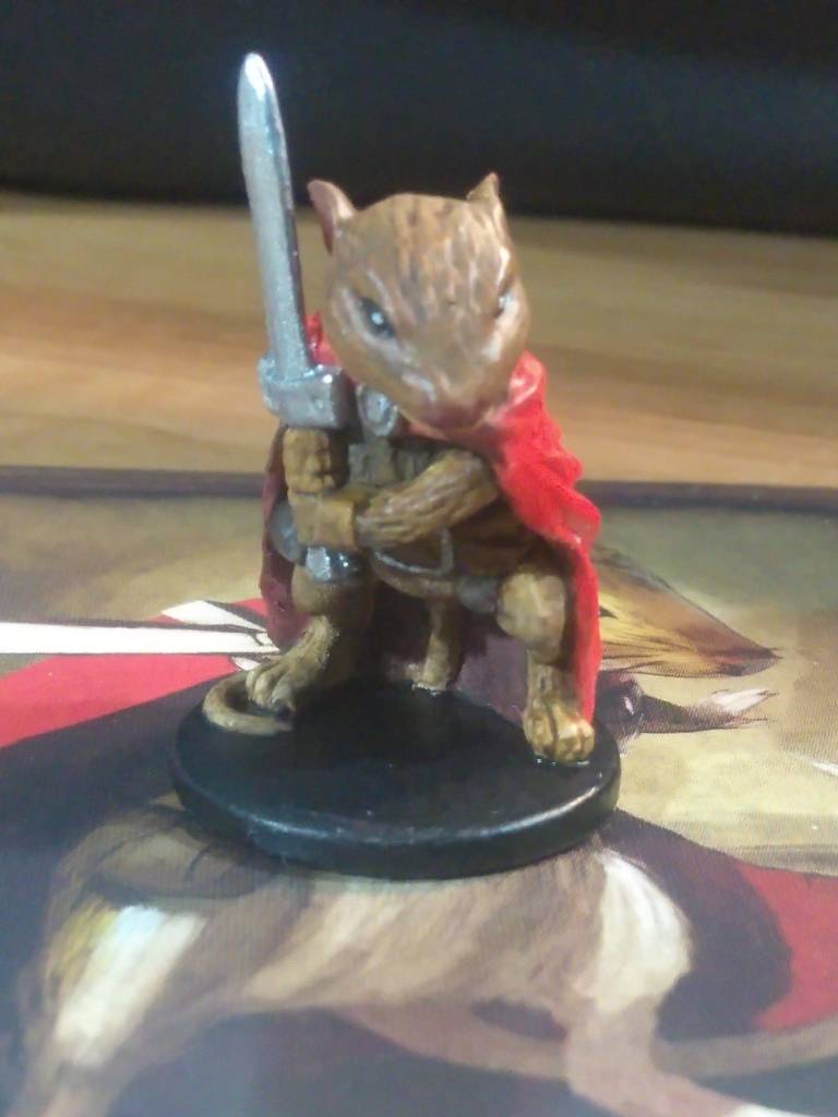
Finally we reach Prince Collin, the hero of our story and definitely not a chestnut person. His cloak turned out a bit pinker than I had in mind, but it cleared up pretty well after a few more coats of red ink. The sword is a particular point of interest for me since I had a chance to ask the sculptor why it’s so plain compared to the rest of the models. It turns out that that’s because it’s Collin’s training sword, which he eventually upgrades to the Sorrow Blade towards the climax of the narrative, so it’s supposed to look a little bit underwhelming in a hint at what he’ll eventually grow into over the course of his adventure.
We’ll finish up with a group photo that I took between Lily and Collin: